


This article spells out exactly what you can expect with the return of these features. It covers our new and improved process for rolling out new features to you, ensuring plenty of opportunities to add your feedback so we get things right on release.
What are we doing?
The changes being made cover 3 different sections:
- Improved User Profiles
- Direct Messaging
- Beta releases for new features
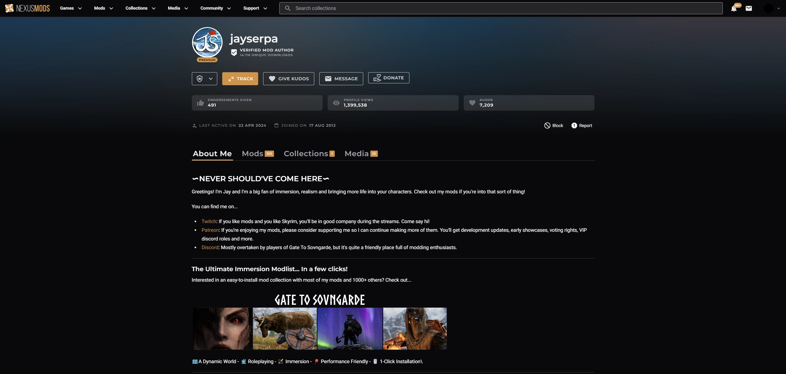
User Profiles:
We are bringing many new improvements to the profile page and moving them into a more modern backend that has better support for our developers. We hope you also find them more intuitive, better looking, and more fitting with the updated site.
This includes:
- The return of the much loved “About Me” section using Markdown text formatting. We have imported your old “About Me” sections and converted them from BBCode to Markdown. This is a part of the move to our more modern editor. This much-requested change has by necessity resulted in the removal of a few formatting options that BBCode provided. We are interested in hearing your thoughts on this.
- Improvements to the filtering of Adult Content.
- A new tab to showcase Collections you have published.
- A Total Unique Download counter for verified mod authors that will update daily. This should help you see when you qualify for our Free Premium for Mod Authors program.
- We are trialling using infinite scroll on profile pages to gauge opinions on its further use vs page-based separation.
- The return of reporting Terms of Service violations for profiles.
- Profile URLs now use usernames rather than userIDs. This should make it much easier to go directly to an author's profile. E.g. https://next.nexusmods.com/profile/JustThatKing/about-me instead of https://nexusmods.com/users/3194960
Unfortunately, we took the difficult decision to remove Activity Feeds from User Profiles. The feature needs a rework from the ground up, it was causing major performance issues which we did not find acceptable (over 1 minute load times were very possible). They will not be returning in the short term. We may consider reimplementing this feature in the future.
Direct Messaging:
- Restoring the much-requested “Message” button to user profiles.
- Restoring the unread notifications indicator for new messages you receive.
- Ensuring that you can message any site user from their profile, without them having to create a forum account directly.
- The new forums inbox theme has been updated to more clearly highlight which messages are read or unread.
- The return of a link from forum profile pages to profile pages on the site.

Beta Release Process:
As some of you may have seen, we have used a new rollout process which will be used in the future for many of the features being added to the site. We are trying to improve our processes to ensure that we gain your valued feedback on changes to the site as soon as possible. This new beta feature will allow you to opt in/out to test the upcoming changes whilst letting you roll back anytime during the beta.
We have been hard at work making changes to the Profile page during the 7 week beta and a full list can be seen in the Feedback forum thread.
Changes made to the User Profile page as a direct result of your feedback include:
- Layout changes to show more content
- UI changes to improve usability on lower resolution display and using Windows scaling above 100%.
- Default sorting for the “Mods” tab has been reverted to Recently Added
- Many other sorting options have been reimplemented, including: Unique Downloads, Last Updated, Mod Name (A-Z), File Size, Last Comment and Random.
- Multiple bugs have been found and fixed
- Changed many different formatting elements for mod tiles.

Why are we making these changes?
We are aiming to return requested features as well as to resolve technical debt.
All the existing pages are built in a framework that is no longer supported and difficult to work with, so we need to move them into a more modern one with better support for our developers. I cannot overstate how important this is, as our current infrastructure is incredibly difficult to change, severely limiting our ability to make changes to the site and scale for the significant growth of the community. This is part of the wider work we are undertaking to update the site. We can’t move everything at once as there are a lot of pages on Nexus Mods, for now we are moving User Profile pages.
There’s a ton of additional things we want to do with user profiles in the future. This first update is mostly about technical improvements, with other features to come down the line.
These changes also restore the functionality that was lost with the forum upgrade. They are much-needed updates to ensure that everyone on the site can easily contact each other in a private setting and receive timely notifications when they have been messaged.
When are we doing it?
Our new “Beta” release process has seen us go through multiple iterations, taking your feedback into consideration to try to get the best full release possible. Thank you for all your feedback and we hope you enjoy the new Profile page as it goes live later today.
Edit: It's live right now!
321 comments
Comments locked
A moderator has closed this comment topic for the time beingAll feedback is taken onboard and there's a lot of comments to go through, some of them pretty bluntly negative to be frank.
When building a page for a wide variety of users with diverse objectives, screen sizes and levels of expertise, a fine line needs to be walked.
Our objective is to provide the best possible experience to the widest number of site users.
We will be following up with some deeper discussion around our design choices and philosophy in a more in-depth blog post.
Comments have been locked on this news post for now, while we work our way through the feedback.
Thanks again.
• Make notification of which are the mods we downloaded more visible. the little white checkmark is not noticeable enough
• Make clear notification of which one of those mods has been updated since your last visit visible again. Removing that was really bad move for those who track updates!
• add search section within mod section of users. finding something on pages where users have dozens and hundreds of mods is really hard now because everything is so big and stretched out and pages are gone
• better yet, REMOVE INFINITE SCROLL FROM MOD PAGES AND GALLERIES it's unbearable!
• you need to fix new images users uploaded not showing up in their new galleries. Some of the best new images are now missing
• you need to make sort by new/recent always a default!
• removing user activity was a huge mistake! as it gave user insight in what their friends and people they follow like and endorse, especially if they have similar taste in mods and games
• the overall design of mod pages and galleries is UGLY! you claim you did it for readability but actually everything looks more messy and less readable and cluttered now. on PC's desktop with big screen... WHICH IS 90% OF YOUR USER THAT ACTUALLY USE AND MOD ON THIS SITE, it looks really hard on the eyes. Way to much wasted space and hard to actually see stuff! and we dont need those ugly gray boxes/containers around every mod and picture wasting space.
please listen to what community of long term users is telling you!
EDIT: you locked comments and replies so I will add this here
thanx for responses- I'd like to add specifically on "downloaded/updates available" notifications on mod thumbnails. I think the main issue on why they're so hard to see now is because you made them white. the previous yellow version was more visible. lots of mods have white backgrounds so it's easy to miss them.
Here is comparison of the old vs new view of these... you can see how much harder the white ones are to see. especially when you have to scroll to profiles of someone who has many mods. making those some brighter color would be better.
We've added a drop-shadow to this so that it stands out more.
This wasn't removed and does display an "Update available" tag.
Great feedback. This didn't actually exist on the old profile page, so is a new feature that we'll need to consider. I'd encourage you to add this as a suggestion on our feedback board.
I think I've replied elsewhere on this, but the overwhelming feedback seems to be that page-based pagination is preferred. We'll stick with that and get the profile page updated to use it again soon.
Thanks to anyone reading and engaging on making this clear.
I've already replied to you on this that we're working on a fix now, but I'm happy to reply again with more detail. This is a regression that was working when tested but somehow made it's way to production and we're not sure how, sorry for the inconvenience.
This is already done for the Media tab, please check again.
The Mods tab will respect your site preferences, exactly as the old page did.
We covered this in the article, but I'm happy to cover it again in more detail. The old activity feed was based on a legacy system that was brittle and could not be easily changed without significant amount of developer effort (basically a full re-write). The problems we found with old system were that when someone took an action that broke our Terms of Service, for example uploading an image with very explicit content, we couldn't remove it. This, along with a couple of other issues, left us concerned that the old activity feed could be really easily abused and we weren't confident about leaving it as is.
The activity feed needs to be rebuilt from the ground-up in the future, as per the article. We will circle back to this in the future.
I am sorry if you find it ugly. It might be useful if I share some data. 60% of our site users visit Nexus Mods on a Desktop, these are our most important visitors as modding takes place on a PC. The page is designed to work well at our users most common screen size, which is 1920x1080 (and 52% of our site traffic). 40% of our site users visit from a mobile device. Whilst this subset of users is not our main priority, we try to make sure that they have a smooth experience too.
A couple other bits of feedback we're addressing, that weren't raised above:
We're also working on a long-form style content piece about our approach to UI Design and the guidelines we have (and are working on). When this is ready we'll share it with all of you.
Infinite Scroll
Please do not apply infinite scrolling to the rest of the site. I have a poor internet connection and it is incredible slow to populate mods. I much prefer to click in between pages of a set amount of mods at a time.
1. It's easier to digest the content at any given time instead of having a constant list of mods populating. If I am deep into search for somethings specific I don't want to have to scroll a gajillion mods backwards to something I had looked at earlier. Its especially heartbreaking when a page reloads on a site with infinite scrolling and I lose all of my progress.
2. Its easier on my devices because of my internet connection. Being able to load a set amount of results at a time is much easier to deal with instead of constantly getting interrupted and having to wait on more results to populate. That makes me want to pull my hair out.
If the team wants to move forward with the feature, I would like to see a site preference option where we can choose one method over the other.
Download Status
The icon that indicates whether you have downloaded it or not is super easy to miss. I would be nice if that was a different color, or bigger, or a banner. I think it should be the same as the "update available" indicator but, even that easy to miss with is being white. Something that doesn't require you to go out of way to look for it.
Default SortingI saw that it actually is a preference option, my bad.Having the default filter set to "endorsements" isn't bad at all. When I visit mod author pages regularly, I like to see what's new and what their recent work is. It would be nice, again, to have a preference option here or to have it remember your last used filter.
Background Art
I like the background art that is normally "behind" the page. Not sure if that the correct way to refer to it or not. I think having the game's art in the background really adds to the feel of the site and sort of celebrates the atmosphere of the game. I know that user profiles are game-agnostic so its not a huge deal but, I think there is opportunity to do something nice in its place. Even if we don't get background for user profiles and other pages not specifically tied to a game, It would super cool to see each game have its own background art!
I like the new style. It's a refreshing new take that still feels familiar. I enjoy the way that the mod tiles look with the mod author profile pic and I like all of the info on them but, I think some of the text needs color or something to break up all the white text. For things that myself and other users don't vibe with, I'm sure any discontent would be tempered with a preference option in the settings. Again, I like it. However, I think some things need to be revisited.
And I have had members telling me when they go to look at my image, it is a black screen and they have to search through uploads page to find image.
A new UI that presents less information than the old one did is an objectively worse UI.
Let's review the ways this is worse:
- The entirety of the first row of mods on a profile's page should be presented. Not this partial-cut-off-at-the-bottom deal.
- 5 mods at a time per row has been an ingrained visual standard for years now, any less is not only less-useful, but also irrational to the expectation of that visual standard. We are used to it, don't change it for less.
- Having the mod author's profile image stamped onto every mod from their own profile page doesn't make sense. I'm just going to see the exact same image a hundred times now. This feature would fit better when browsing mods on a game's page instead. It's just visual noise like this.
- The entire portion above the profile tabs(about me, mods, collections, media) takes up far too much screen space, just in general. I'm maybe interested in that information at a glance, and only if I'm interested in checking out the author's about-me page, but beyond that it is just eating half my screen and showing me nothing of interest. It should either be smaller, or only exist on the about-me section. Hell, why not both?
- The mod categories don't really warrant eating a whole line down a mod's display. It could be moved, or even overlaid onto the mod's preview image(especially if you're already willing to overlay profile pictures onto them).
I'd almost argue for displaying even more mods across the page rather than less, but I think matching the same display width as before is a good call, even if a waste of space.Here's a quick mockup I did of how this would look objectively better for the intended purpose; browsing mods for a PC on a standard PC monitor :
I don't really understand why that's outside their scope here when you can already search for mods with so many filter properties.
Like, I don't need buttons the size of a credit card, I just need the ability to decide if my buttons should be that big if I'm mostly-blind or something.
Let us decide.
Regarding what you said, the changes that I think are really necessary are:
edit: the idea to allow users to set row counts is also really cool
Edit: well, it tries opening new page as a pop-up window. Obviously Firefox blocks it. Also messages require separate forum login?